Hi, everyone! I’m particularly pleased to share with you today’s interview. I’ve invited Marie Jackson, the founder of Looking-Glass Translations, a while ago and she agreed to take part in this series about branding. Marie is a French and German into English translator and mainly works in the marketing, business legal and logistics fields. Marie is also an interpreter and a teacher. When not working, you can find Marie on Twitter or on herblog.

Hi Marie, thank you for being a part of this series! First, could you tell us a little bit about the genesis of your business? How did you decide to go freelance and why did you come up with a branding for your activity?
Hi Emeline, thank you so much for having me! As you know, I am thrilled to be taking part in this brilliant series. I run a boutique translation company called Looking-Glass Translations, offering SMEs, lawyers, logisticians, and marketing gurus professional translation, interpretation and business services from French & German into English. I’ve been involved with the industry for nearly ten years now, but only launched my own company in June 2012. Since most of us in this industry work on a freelance basis, I never really made that big decision to set up a business; it was a given for me from the very beginning. 2012 just seemed like the right time. The main reason I invested in developing my own brand is that I believe strong branding is vital if you want to attract the right people to your business. Some entrepreneurs are content to accept any and all clients, but I have a very specific type of client in mind for my business, and having a brand helps me to reach them. It also enables me to highlight the differences between me and my colleagues – all while demonstrating that I value my business and branding as much as my clients value theirs.
I noticed that your brand relies mostly on your services instead of your profile. Do you find it as a way to differentiate yourself?
I don’t necessarily see my focus on services as a way to differentiate; I believe that my clients care far more about what I can do for them, than who I am – although the best clients will naturally care more than a little about both. My feeling is that once prospective clients know what my business is about and what it can do for them, they will then move on to find out what I’m all about. Ultimately, my business isn’t about me, it’s about them!
I find the name of your website very original and inspiring. Correct me if I’m wrong, but it instantly reminds oneself of Lewis Carroll’s work, which in turn makes one think of two characteristics – Britain and the written word, which both qualify who you are and what you do. How did you choose it? Was there a lot of brainstorming involved or did it come to you instantly?
Thank you! It took a lot of brainstorming to come up with, but was well worth the wait (and I won’t embarrass either of us with my discarded ideas!). It is very challenging to come up with a name that really speaks for you and your brand these days, especially in an industry in which everyone deals with words and culture on a daily basis; all of the Greek, Roman, and even Egyptian gods of communication are taken, for example! It is a further challenge to come up with a name that translates well across all of your target markets, but I feel that mine is equally effective in my three working languages, as well as in a couple of others that I’m considering adding. You are absolutely correct in spotting the reference to Lewis Carroll! The best thing about my company name is that it has many different interpretations depending on who is reading it. For those with strong ties to the translation industry, Lewis Carroll is almost certainly the first thought; Alice Through the Looking-Glass is a very popular text on translation courses, since it is such a fantastic resource for seminars on linguistics and translation theory. Meanwhile, non-translators find the name reassuring thanks to the subtle reference to the fact that their message will always be perfectly reflected in my work, as will the original layout of their texts. The name is also broad enough to encompass both translation and interpreting, which is important to me, since I offer both. Aside from the positive feedback I’ve had from clients and colleagues, I know that the name is a good one because others have been keen to ‘borrow’ it. That’s why I chose to register the name as a trademark, meaning that I hold all copyrights to it within our industry. I think it’s incredibly important to protect your brand and public image, and I’m pleased to say that it has been well worth the investment.
What about your logo? What does it represent? Do the colours mean anything?
Much like my company name, it took me a long time to decide on the right logo for me and my company. The logo is a stylised LG (for the company name), with the two mirror-image letters interlocking to form a soft, yet interesting spiral. The subtle nod back to the company name and the idea of mirrors is something I really love! The colours in my logo are turquoise, golden yellow, and a strong, warm red, with a subtle light pink for contouring. I naturally gravitated towards these colour groups, because I was very keen to have a balanced colour scheme – I’m a colourful person and I wanted my brand to reflect that, but also wanted to convey class and professionalism. I originally intended to emphasise the red, but soon found this a bit overwhelming. As a result, I opted to make turquoise the stand-out colour on my website and other materials, since green/blue is calm and reassuring (very common in the legal and legal translation industries), and also happens to be my favourite colour. In a way, although I originally had my heart set on the red, the turquoise reflects my own personality much more accurately. I then chose to use the red on all of the action buttons on my website; because the red is so deep and warm, it doesn’t scream ‘sell!’, but is still bright and interesting, adding a dash of colour where it was sorely needed. Finally, the yellow was a must to retain warmth and balance, and really helps to lift the logo off the page.
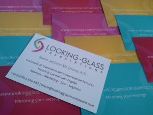
Gotta love Marie’s colorful business cards!
Given my brand’s relatively minimalist colour palette, I wanted my business cards to make a splash. Minimalist on the front, the backs come in four different colours (the four colours in the logo), and are always an interesting talking point; clients and business partners often seem to enjoy choosing their favourite colour!
We all know that branding is more than a name and a logo. If you had to choose three words to represent your brand, which ones would they be?
- Classy – My website and corporate literature are minimalist, and rely more on content than on flashy images to communicate my message.
- Personable – Despite my brand’s classy, professional appearance, and despite the nature of the sometimes very corporate fields in which I work, I’m still an approachable, friendly face in the translation and localisation industry, working as your partner to help you to achieve your goals.
- Professional – I’m not a child goofing off, or a new entrant to the profession with no idea what she’s doing; I’m an expert –quietly confident, always reliable, and always discreet – meaning that your brand is in safe hands when you work with me.
Finally, how do you manage to convey these aspects to your customers?
This is a really interesting question, and I’ll try to sum up how I approach this element of brand reinforcement as concisely as possible. The main pointer is that you have to think about your brand and business globally (i.e. in its entirety) to really understand the message you’re communicating to others – and it is absolutely vital to be consistent. I even state this on my website; consistency is key to branding. Furthermore, if I want my clients to trust me with their content, I have to be able to demonstrate that I care as much about brand consistency as their marketing and PR department. Since our businesses are an extension of ourselves, this is something I really take to heart. A big way in which I convey my brand (aside from general consistency) is in the way I talk about it to colleagues and clients. I don’t believe in working for people; I work with them. Partnership, openness and communication are key to a successful business relationship with me. I also respect those who choose not to work with me, either because we have different budgetary constraints, or a different vision; I don’t beg or spontaneously lower my rates, I keep things classy, thank the client for the experience, and move on. Sometimes they come back to me later on. Finally, I make it my mission to turn every client into a raving fan, and part of this philosophy is remembering that my clients aren’t just my end-clients; they’re everyone I ever come into contact with in the course of my work, from outsourcers and colleagues to prospective clients and external business partners (e.g. my accountant!).
Thanks ever so much for being a part of this series, Marie!
Thank you very much for having me! I can’t wait to read the rest of the series.
Cet article What’s in a Brand? Marie Jackson from Looking-Glass Translations est apparu en premier sur In Touch Translations.


